Introduction To Pie Charts
There are many cases where we need to view some data just get a relative comparison of various values with each other.
A typical example would be to view your monthly household expenditure.
Let us say a family spent $Rs\ 20,000$ on a particular week, and you would like to analyse how the expenses where made.
The following table could be a representation of a breakup of this expenditure:
| Item | Expenditure (In Rupees) | Description |
| Food | 5000 | Groceries, daily shopping |
| Tranportation | 4000 | Fuel, public transport fares |
| Education | 5000 | Books, stationeries, tuition fees, etc |
| Utilities | 1500 | Electricity, water, telephone, internet bills |
| Medical & Healthcare | 500 | Doctors/hospital/medicine cost |
| Entertainment | 1000 | Movies, outings, etc |
| Miscellaneous | 3000 | Mostly out of turn expenditures |
| Total | 20000 |
-----------book page break-----------
In pie chart the angle $360^o$ always represents a value of $100\%$
Now to be able to create a pie chart for this data we will first need to convert all the individual categories to percent of the total and then calculate the angles for each category and then calculate the angle for that percentage.
In our example the total value is $Rs\ 20,000$ which represents $100\%$ or $360^o$.
The amount spent for transportation was $Rs\ 4,000$ which is $\dfrac{4000}{20000}\times100 = 20\%$
Now, $20\%$ of $360^o = \dfrac{20}{100}\times360 = 72^o$ will be the angle value for the sector representing the item $Transportion$.
Let us rewrite the given table with the percentage values, and corresponding angle values for each category.
-----------book page break-----------
| Item (A) | Expenditure (B) | Percent Of Total (C) | Angle of Slice (D) |
| Food | 5000 | $25\%$ | $90^o$ |
| Transportation | 4000 | $20\%$ | $72^o$ |
| Education | 5000 | $25\%$ | $90^o$ |
| Utilities | 1500 | $7.5\%$ | $27^o$ |
| Medical & Healthcare | 500 | $2.5\%$ | $9^o$ |
| Entertainment | 1000 | $5\%$ | $18^o$ |
| Miscellaneous | 3000 | $15\%$ | $54^o$ |
| 20000 |
A good way to check for errors will be to take the values of column $C$ and check if they add up to $100\%$ and whether the values in column $D$ add up to $360^o$ or not.
In our case, column $C$ values add up to:
$25 + 20 + 25 + 7.5 + 2.5 + 5 + 15 = 100$,
and column $D$ values add up to:
$90 + 72 + 90 + 27 + 9 + 18 + 54 = 360$
Both the column values match, hence we are good to go to the next step.
-----------book page break-----------
The next steps would involve the following:
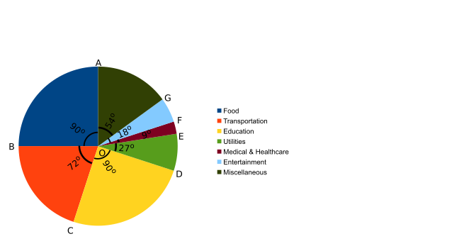
- Draw a circle with centre $O$, and draw a single radius $OA$
- Draw another radius $OB$ such that $\angle BOA = 90^o$. The sector $BOA$ represents our first category, that is, $Food$
- Draw another radius $OC$ such that $\angle COB = 72^o$. The sector $COB$ represents our second category, that is, $Transportation$
- Likewise, draw one sector for each of the remaining categories. And we have a complete Pie chart for our data as shown below.
Reading A Pie Chart
We saw how to draw a pie chart from a given set of data. Now let us see how to read a pie chart.
To be able to read a pie chart you need to know the exact angles of each sector, and either the sum of all the categories or at least one of the categories.
Let us say we have the same pie chart for another week, but the total expenditure for that week was different.
-----------book page break-----------
Let us try to solve the following problems:
Given the above pie chart, and the fact that expenditure on transportation was $Rs\ 6000$, how much was the expenditure on the category $Utilities$?
For our new data we know that $Rs\ 6000$ corresponds to $72^o$ and we need to find out what was the expenditure corresponds to the $Utilities$ sector, which is $27^o$
$72^o$ corresponds to $Rs\ 6000$
$1^o$ corresponds to $Rs\ \dfrac{6000}{72}$
$27^o$ corresponds to $Rs\ \dfrac{6000}{72} \times 27 = Rs\ 2250$
Similarly, we can find out the actual information about any other category from the above data.