Introduction To Graphs
Candies Sold During Last Week
| Orange Flavored | Pineapple Flavored | |
| Monday | 2387 | 1727 |
| Tuesday | 2939 | 2337 |
| Wednesday | 3959 | 3420 |
| Thursday | 1929 | 2393 |
| Friday | 2488 | 1893 |
| Saturday | 4983 | 3194 |
| Sunday | 5938 | 4392 |
-----------book page break-----------
Now let us try to answer the following questions:
1. On which days did Pineapple flavored candies sell more than orange flavored candies?
2. On which day of the week the highest number of orange flavored candies were sold?
3. On which day of the week the lowest number of pineapple flavored candies were sold?
To answer these questions you have to read the table again and again.
Now let us look at the chart below. This is the pictorial representation of the same numbers given below.
Looking at this chart can you try to answer the above questions? You will see how quickly and easily you can answer all of the questions.

-----------book page break-----------
Graphs or charts are used to represent any given set of data when you need to quickly understand how things are behaving. For example if you were to answer the question, which flavor is generally more popular than the other, just by looking at the chart you can see that on most of the days orange flavored candies sold more than the pineapple flavored ones. So we can say that, orange flavor is more popular than the pineapple flavor.
Now, let us see what our chart contains.
- The horizontal line along which the days are written is called the X axis (plural axes).
- The vertical line along which the numbers are written is called the Y axis.
- In case of charts, at least one of the two axes needs to have number values, the other can be anything like day, month, year or any other text. Some charts use number values on both axes. We will see examples of them in a different lesson.
- The horizontal lines that you see in the above chart, are called the grid lines. These lines are present for easy reading of the graph. In case both X and Y axis contains number values, there can be both horizontal and vertical grid lines, as we will see in one of graphs later.
There are various types of charts that can be created. The charts that you need to select will depend upon the type of data you are trying to utilize and also on the type of information you are looking for.
There most common types of charts, that we will see for now, are:
- Column Charts
- Bar Charts
- Line Diagrams
What you saw above was an example of a column chart.
-----------book page break-----------
Let us try to see how this same data would look like when you are using different types of charts to represent the same data:
Bar Chart:
Bar charts are same as Column charts, with only the axes interchanged. Here, as you see, the Y - axis contains the day names and the X - axis contains the number of candies sold.

-----------book page break-----------
Line Diagram:
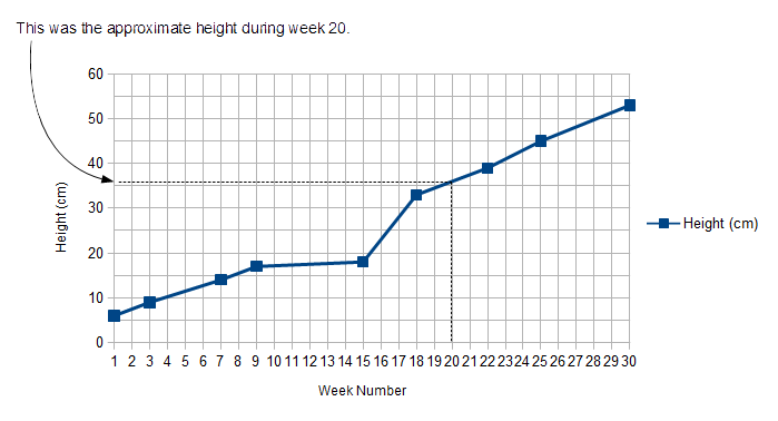
Line diagrams are very useful when you have numbers in both the axes, and you want to guess the value which is not in your data table. Let us take an example to understand this. Let us say you have bought a sapling, planted it and nurtured it well. You also want to monitor the growth of the plant, so you measure the height once a week during some weeks that you had time and noted down the height for each day that you measured. The table would look something like below:
Height of Plant Measured During Different Weeks
| Week | Height (cm) |
| 1 | 6 |
| 3 | 9 |
| 7 | 14 |
| 9 | 17 |
| 15 | 18 |
| 18 | 33 |
| 22 | 39 |
| 25 | 45 |
| 30 | 53 |
-----------book page break-----------
Now, let us say you wanted to estimate the approximate height of your plant during week 20. Since you did not take measurement during week 20, the value is not in your table. Also, if you drew a bar chart or column chart like before, it would be difficult for you to estimate the height for values that are not present in either the X - axis or the Y - axis. In this case we will use a Line Diagram (also called X-Y chart) like below. If you draw a vertical line from the value Week 20 on the X - axis, to meet your graph, and then from that point you draw a horizontal line to meet the Y - axis, the Y axis value will give you the approximate height of your plant during week 20. This is shown using dotted lines below. As you can see, the height during week 20 was about 36 cm.